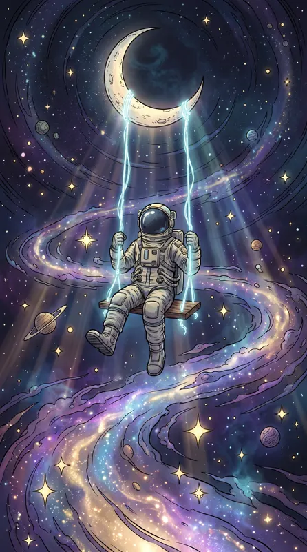
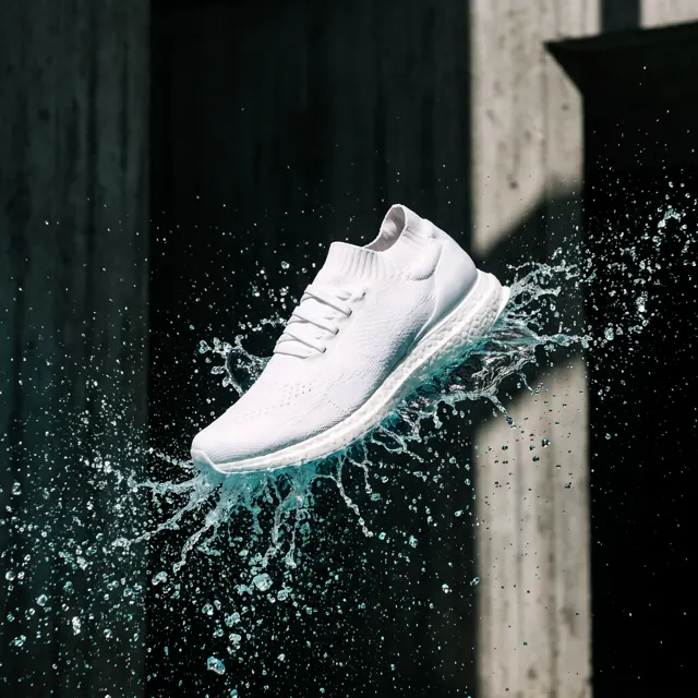
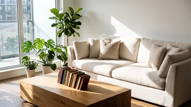
Decide where the image will live first. Use 1:1 for product listings and square posts, 4:5 for Instagram and Xiaohongshu feeds, 9:16 for phone wallpapers, Stories and vertical posters, and 16:9 for desktop wallpapers, slides and video thumbnails. Choose before you generate — the ratio shapes the composition.
The four ratios at a glance
Output goes up to 4K: on Nano Banana Pro, Nano Banana 2 and GPT Image 2 an image is roughly 4,000 px on the long side (exact pixels depend on the model and ratio), and these models also offer a native 3:4. The standard model outputs about 2K. The four common ratios:
| Ratio | Orientation | Typical uses |
|---|---|---|
| 1:1 | Square | Product listings, square posts, avatars |
| 4:5 | Portrait | Instagram portrait posts, Xiaohongshu (crop to 3:4), blog images |
| 9:16 | Tall portrait | Phone wallpapers, Stories, Reels and TikTok, vertical posters |
| 16:9 | Landscape | Desktop wallpapers, slides, video thumbnails, website banners |
The ratio changes the composition, not just the size
Give the same prompt a different ratio and the model rearranges the scene rather than cropping it.
- 16:9 suits things that spread horizontally: horizons, coastlines, skylines, a row of people.
- 9:16 suits things that rise: waterfalls, towers, a standing figure, layers from sky to ground.
- 1:1 is best for one centered subject — a product, a bowl of noodles, a face.
- 4:5 is the most forgiving portrait: depth without the narrowness of 9:16.
So the order is ratio first, composition second. Ask for “a sweeping panoramic coastline” in a 9:16 frame and it will be squeezed. This is also why cropping a finished 16:9 image into a 9:16 one rarely works: you keep a narrow slice of a scene that was designed to be wide.
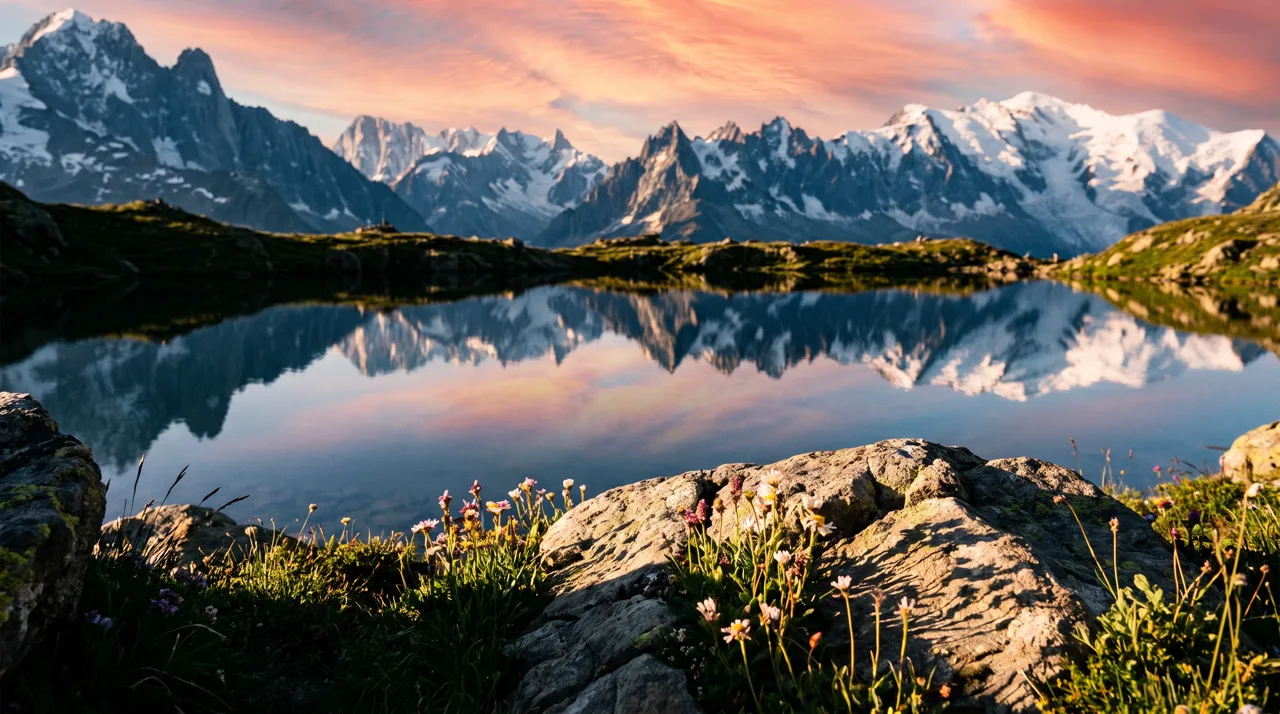
Prompt idea: an alpine lake at sunrise, mirror reflection, peach sky, wildflowers in front. The 16:9 frame lets the lake and range stretch out.
Platform size chart
| Use | Common spec | Generate at | Crop needed? |
|---|---|---|---|
| Marketplace product images | Square, 1000 px or more for zoom | 1:1 | No |
| Instagram feed (portrait) | 4:5, 1080×1350 | 4:5 | No |
| Instagram Stories, Reels, TikTok | 9:16, 1080×1920 | 9:16 | No |
| Xiaohongshu (RED) notes | 3:4, 1080×1440 | 3:4 or 4:5 | None at 3:4; about 6–7% of the width at 4:5 |
| Pinterest pins | 2:3, 1000×1500 | 4:5 or 9:16 | Trim width or height |
| YouTube thumbnails | 16:9, 1280×720 | 16:9 | No |
| Slides | 16:9 | 16:9 | No |
| Desktop wallpaper | 16:9 | 16:9 | No |
| Phone wallpaper | About 19.5:9 to 20:9 | 9:16 | Sides trimmed slightly by the system |
Platforms adjust their recommendations over time, so treat this as current common practice. For Xiaohongshu cropping in detail, see our Xiaohongshu cover guide; for listings, the AI product photo workflow.
Cropping for Pinterest
Pinterest favors 2:3. From a 4:5 image, keep the full height and trim about a sixth of the width, roughly 8% per side. From 9:16, keep the width and trim about a sixth of the height. Either works if the subject is centered.
Phone wallpapers at 9:16
Choose 9:16 in the AI wallpaper generator and keep three things in mind:
- The sides get trimmed. Most phones are narrower than 9:16, so the system fills the height and crops about a sixth of the width in total. Center the subject.
- The top belongs to the clock. Ask for “clear sky or empty space across the top” so the time stays readable.
- The bottom belongs to the dock. Put the most interesting part of the image in the middle third.

Prompt idea: a rainy future-city street, neon signs, a hover train between towers, a lone figure with a clear umbrella, Cyberpunk style, 9:16.
For a calm wallpaper that never fights the clock or icons, try an abstract gradient — there is no subject to crop badly:
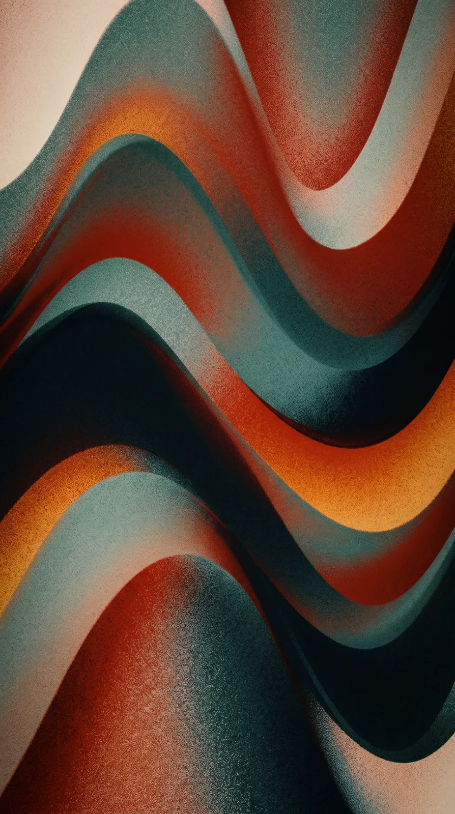
Prompt idea: a flowing liquid gradient with the Liquid Gradient style at 9:16. Name your own colors in the prompt to change the palette.
Desktop wallpapers at 16:9
- Resolution: on the models that output up to 4K, a 16:9 image is roughly 4,000 px on the long side — it covers 1080p and 1440p and matches a 4K monitor. The standard model is about 2K: crisp on laptops and QHD monitors, slightly soft up close on 4K.
- Leave room for icons: desktop icons usually sit on the left, so place the subject center or right: “subject on the right third”.
- Ultrawide screens: a 21:9 crop can be taken from 16:9 by trimming top and bottom; keep the subject vertically centered.
Landscapes, fantasy scenes and anime backdrops make the best desktop wallpapers. Browse the prompt library for ideas, starting with the alpine lake sunrise.
Two easy-to-miss cases
Avatars: a second, circular crop
Most social platforms show profile pictures as circles, cutting off all four corners of a square image. Generate avatars at 1:1 and write “head and shoulders centered, simple background” so the face sits well inside the circle, with no hair or ears touching the edge. Our anime art guide includes avatar prompts.
Slide backgrounds: 16:9 and quiet
A slide background has to make room for text. Ask for “a large empty area on the left, low contrast, soft muted tones”, then lay a semi-transparent color block over the image in your slide software before adding text. Readability improves dramatically and the image still sets the mood.
Picked the wrong ratio?
There is no outpainting, so you can only crop smaller:
- 4:5 to 1:1: trims about a fifth of the height — usually fine for centered subjects.
- 16:9 to 4:3 or 1:1: loses a lot of width; regenerating is usually better.
- 9:16 to 4:5: loses nearly 30% of the height; only works if the top and bottom were empty anyway.
When the gap is large, regenerate at the target ratio. At 10 credits per image on the standard model and 4–8 on the others, that beats salvaging an awkward crop.
One campaign, several ratios
Campaigns often need a landscape banner, a vertical poster and a square post at once. Don’t crop all three from one image. Run the same prompt at 16:9, 9:16 and 1:1 so each composition is built for its frame. If a product must stay identical across them, upload it as a reference in image-to-image and generate each ratio from that. Our AI poster workflow walks through a full example.
Ratio chosen? Head to text-to-image or open the studio.