When an AI image doesn’t come out right, the fix is usually in the prompt. First work out whether the problem is color, content, composition, style or detail, change that one thing, and generate two to four new images to compare. Here are the 14 problems we see most, with the fix for each.
Quick reference
| Problem | Usual cause | Fix |
|---|---|---|
| 1. Black-and-white photo | The photo type sometimes leans moody monochrome | Start with “color photo” or name colors |
| 2. Stray text | The prompt implies a poster, cover or sign | Remove those words, describe a scene |
| 3. Misspelled text | AI-rendered text is unreliable | Add text afterward |
| 4. Wrong colors | Only a vague “tone” was given | Name colors and where they go |
| 5. Unwanted objects | Negative phrasing draws attention to them | Describe what you want instead |
| 6. Subject too small or off to one side | No shot size or position | State shot size, share of frame, position |
| 7. Wrong ratio | Composition written before choosing a ratio | Choose the ratio first |
| 8. Cluttered image | Too many elements | Cut elements, ask for empty space |
| 9. Flat, lifeless image | No lighting described | Add time of day, light source, direction |
| 10. Wanted art, got a photo | Wrong image type | Switch image type and style preset |
| 11. Muddled style | Conflicting style words | Keep one style |
| 12. Odd hands | Hands are hard for AI | Choose poses that hide hands |
| 13. Blurry faces in groups | Each face gets too few pixels | Fewer people, bigger main subject |
| 14. Subject changes every time | Text-to-image redesigns it | Use image-to-image |
Color and text
1. The photo comes out black and white
With the photo type, you sometimes get a moody black-and-white editorial look, even when the prompt mentions blue sky. Put “color photo” at the start of the prompt, or name the key colors: “deep blue sky, white dress, turquoise lake”.
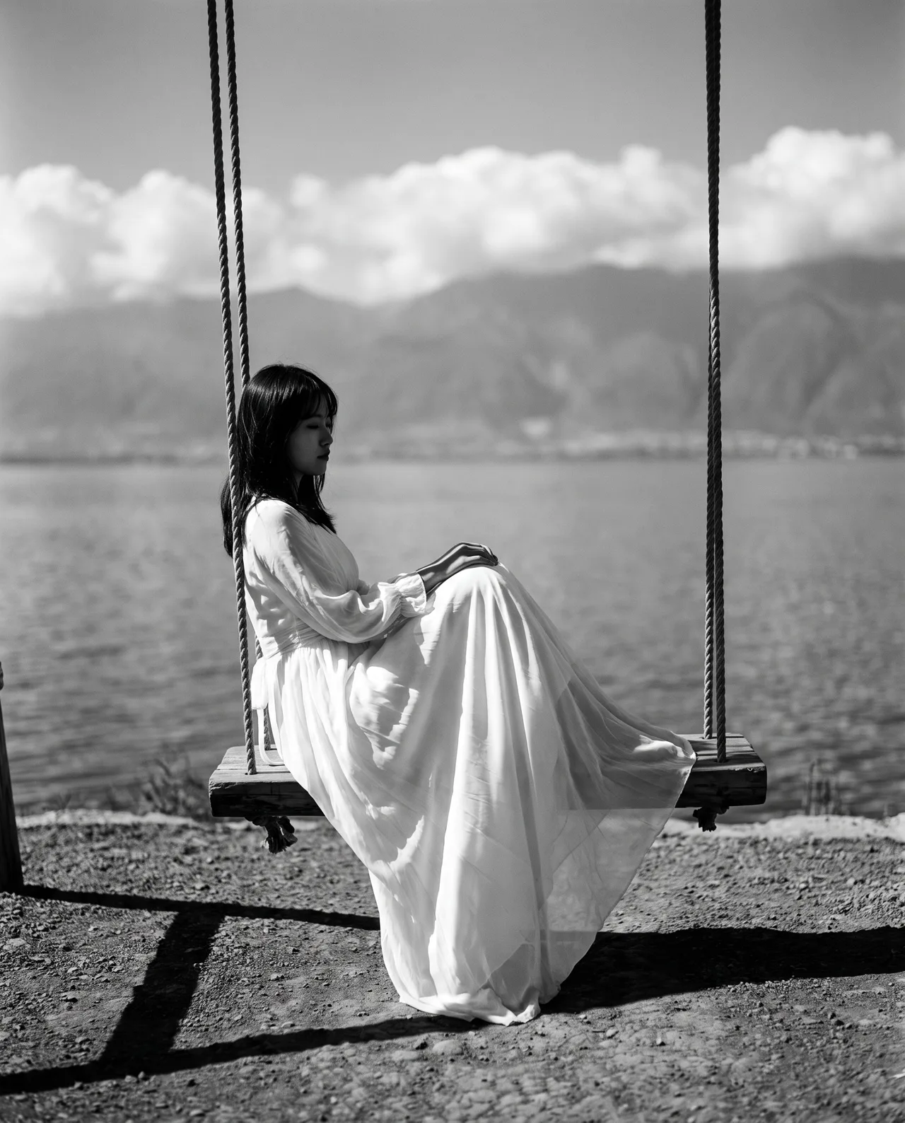
Prompt idea: by Erhai Lake in Dali, a girl in a long white dress on a swing looking at the water, blue sky and white clouds, fresh and calm. The engine chose black-and-white film; add “color photo” at the start when you need color.
The full prompt is in the Erhai Lake entry; copy it, add “color photo” and compare.
2. Stray text appears in the image
The generator keeps text out by default, but words like “poster”, “cover”, “magazine”, “comic” or “shop sign”, or scenes that usually contain lettering, can lead it to add a title or sign on its own.
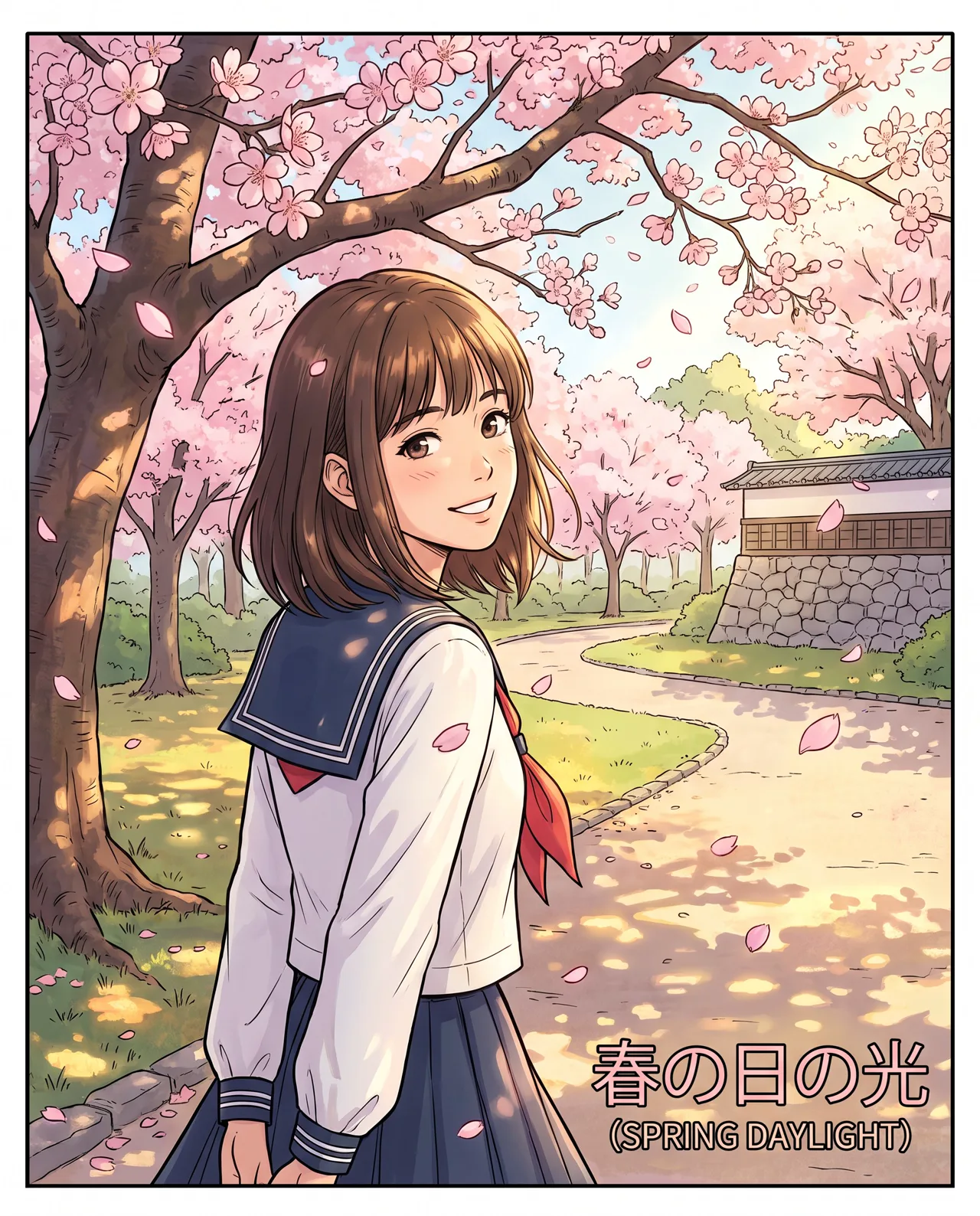
Prompt idea: a girl in a sailor uniform under cherry blossoms looking back with a smile, petals drifting, spring afternoon sun, Anime style, 4:5. The prompt didn’t mention any text; the border and title in the corner appeared on their own.
The fix: remove layout words. “Anime poster” becomes “anime illustration”, “café sign” becomes “café entrance”. If an existing image just has a few letters in a corner, crop or cover them in an image editor; that is faster than regenerating.
3. The text you asked for is misspelled
Even when requested, AI-rendered text often has wrong letters or garbled characters. Add headlines, prices and slogans in a design tool, and in the prompt just ask for “empty space at the top” to leave room.
4. The colors are wrong
“Warm tones” or “fresh palette” are read differently every time. Name colors and say where they go: “wine-red lipstick, blush-pink background, gold accents”. The more specific, the more stable.
Content and composition
5. Unwanted objects keep appearing
There are no negative prompts, and phrases like “no people” or “no clutter” can make the model focus on people and clutter. Rephrase positively:
- “No people” becomes “an empty street”
- “No messy background” becomes “a clean, plain light-grey background”
- “Not too bright” becomes “a dim room lit by a single desk lamp”
If something keeps showing up, look for a word that implies it. Ask for “a busy night market” and it will be hard to avoid crowds.
6. The subject is too small or off to one side
Without a shot size, the subject often ends up small and placed at random. Add three things: shot size (close-up, half-body, full-body, wide), share of frame (“the subject fills two thirds of the frame”) and position (“centered”, “on the left”).
7. The ratio is wrong and cropping doesn’t help
The ratio sets the composition. Pick the ratio first and write the composition to suit it: 9:16 suits scenes that stack vertically, 16:9 suits wide landscapes. When the ratio was wrong, regenerating usually beats cropping. The aspect ratio guide lists which ratio fits each platform.
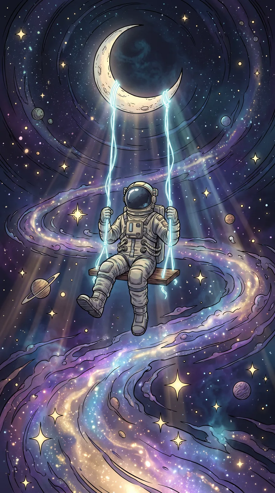
Prompt idea: an astronaut on a swing hanging from the moon, looking down at the galaxy and colorful nebulae, dreamy, Fantasy style, 9:16. Moon at the top, swing in the middle, galaxy below: it fills the tall frame naturally.
8. The image is cluttered
Once subject, props and background details add up to more than five or six elements, things get messy. Cut what isn’t needed, or ask for “a simple background” and “generous empty space”. Three people, two dogs and a car in one frame work better as separate images.
9. The image looks flat
The usual cause is missing light. Add a time and a source: “warm golden backlight at dusk”, “neon reflected in puddles on a rainy night”, “morning light beams through mist”. If a portrait looks plastic, “natural light, candid moment, film grain” works better than “perfect skin”. See the prompt writing guide for more.
Style
10. You wanted an illustration and got a photo
Writing “illustration” in the prompt often isn’t enough; change the image type. There are four: photo, scene (detailed and painterly, good for anime, 3D, watercolor and ink), illustration (flat vector look) and abstract. For a watercolor storybook look, use the scene type with the Watercolor preset; for clean flat vector art, use the illustration type.
11. The style is a muddle
“Ink wash, cyberpunk, realistic photo” in one prompt leaves the model unsure what to do. Choose one style preset and leave other style words out. If you do want a blend, say which leads: “ink wash painting with small touches of neon”. The AI art styles guide compares the options.
Details
12. Hands and fingers look wrong
Hands are a long-standing weak spot for AI images. Since there is no inpainting, rather than retrying endlessly, choose poses that show less of the hands: “hands in coat pockets”, “holding a cup of coffee with both hands”, “half-body shot, hands out of frame”. Generate four and keep the most natural one.
13. Faces blur or distort in group shots
The more people in a frame, the fewer pixels each face gets, and the more likely details break. Keep the main characters to one or two and describe others as “a blurred crowd in the distance” or seen from behind. Check every face in group scenes.
Consistency
14. The character or product looks different every time
Text-to-image designs the subject afresh on every run: ten generations, ten versions. To keep a subject, upload the image you like, or a product photo, to image-to-image and describe the new scene. The whole picture is rebuilt around the subject, which keeps its look. See text-to-image vs image-to-image for when to use each.
Three habits that make fixing faster
- Change one thing at a time. Change three and you won’t know which one worked.
- Generate two to four per run. Results vary, so look at several before deciding whether the prompt or chance is to blame.
- Start from a good prompt. Find a similar image in the prompt library, copy its prompt and edit it.
Credits for failed images are refunded automatically, but images that generate fine and just disappoint are not, so diagnose with the table before you rewrite. Then head back to text-to-image and try again.