The fastest way to illustrate WeChat articles with AI is to generate every cover at 16:9, crop it to a 2.35:1 lead cover and a 1:1 share card, and reuse one fixed style description for all inline images. The same approach works for newsletter and blog headers.
Which images a WeChat article needs
If you run a WeChat Official Account to reach readers in China, each article uses up to four kinds of image. They have different shapes and different jobs, so decide on the slot before you pick a ratio.
| Slot | Typical shape | Generate at | Watch out for |
|---|---|---|---|
| Lead cover | About 2.35:1, e.g. 900×383 | 16:9, then crop | Keep the subject in the vertical middle band |
| Secondary cover and share card | 1:1 | Center crop from 16:9, or generate 1:1 | Must read clearly at thumbnail size |
| Inline landscape image | Flexible | 16:9 | Good for section openers and concept art |
| Inline portrait image | Flexible | 4:5 | Fills a whole phone screen, so use sparingly |
Our generator offers four ratios and no 2.35:1, but a 16:9 image comes out at up to 4K — roughly 4,000 px on the long side, or about 2K on the standard model — which leaves plenty of room to crop. For every other platform size, see the aspect ratio guide.
Covers: generate once, crop twice
What each crop removes
- 2.35:1 crop: the width stays the same and the height drops to about three quarters, so roughly a quarter goes from the top and bottom combined.
- 1:1 crop: you keep the central square and lose about 22% of the width on each side, a little over 40% in total.
The only area both crops keep is the middle of the frame. So every cover prompt needs one phrase: subject in the center of the frame, clean empty space all around. Push the subject to one side and the share card cuts it off; let it fill the frame top to bottom and the wide cover crops off the head and feet.
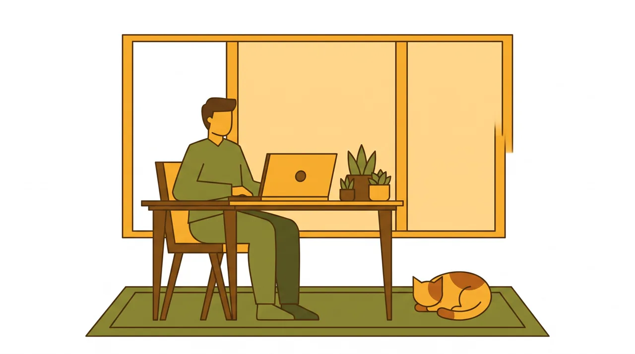
Prompt idea: a person working remotely on a laptop with plants, a big window and a cat, Flat style, 16:9. The figure and desk sit in the middle third with space on both sides, so both crops keep the point.
The palette here is just mustard, olive and brown with simple outlines, which survives being shrunk to a thumbnail. Accounts about productivity or remote work could use it as a cover template and swap the subject; the full prompt is in the prompt library entry.
Should the cover include text?
WeChat already shows the article title next to the cover, so the image rarely needs words. If you want a column name or issue number, add it later in a design tool. The generator keeps text out of images by default, and even when you ask for text the letters can come out wrong, so adding it afterward is more reliable.
Write a style card so every article looks like yours
Readers recognize an account by its look. If every article uses a different art style, the feed feels scattered, however good each image is. The fix is a short, fixed style card per column that you paste into every prompt, changing only the subject and the scene.
Style card: Workplace column
Style preset: Flat
Colors: mustard yellow and olive green on a white background
Detail: simple outlines, no more than five elements
Composition: subject in the center, empty space all around
Collapse the last four lines into one sentence and append it to the subject. For an article on cutting pointless meetings:
A person sitting at a meeting table staring at a wall clock, papers scattered on the table, mustard yellow and olive green on a white background, simple outlines, subject in the center with empty space all around
Rules that keep the style stable:
- Pick exactly one style preset. Once a preset is selected, leave other style words out of the prompt so two styles don’t fight.
- Name actual colors. “Fresh colors” is read differently every time; “mint green and off-white” is not.
- Cap the number of elements. Flat illustration gets messy fast, and “no more than five elements” keeps it clean.
- Use image-to-image for recurring characters. If your account has a mascot, upload it to image-to-image and describe the new scene. It keeps its look instead of being redesigned each time.
To compare the styles and where each one fits, see our AI art styles guide.
Inline images: how many, and what kind
Inline images give readers a breather in a long article and turn an abstract idea into something they can see. One image per main section is usually enough, which works out to three to five for a 2,000-word piece.
Three useful kinds:
- Concept images translate the argument into a scene. For procrastination: “a person staring blankly at a mountain of sticky notes”. For compound interest: “a small tree growing out of a pile of coins”.
- Scene images show a place or object from the story so readers can picture it.
- Breaks carry no specific information, just mood. Drop one in the middle of a long piece.
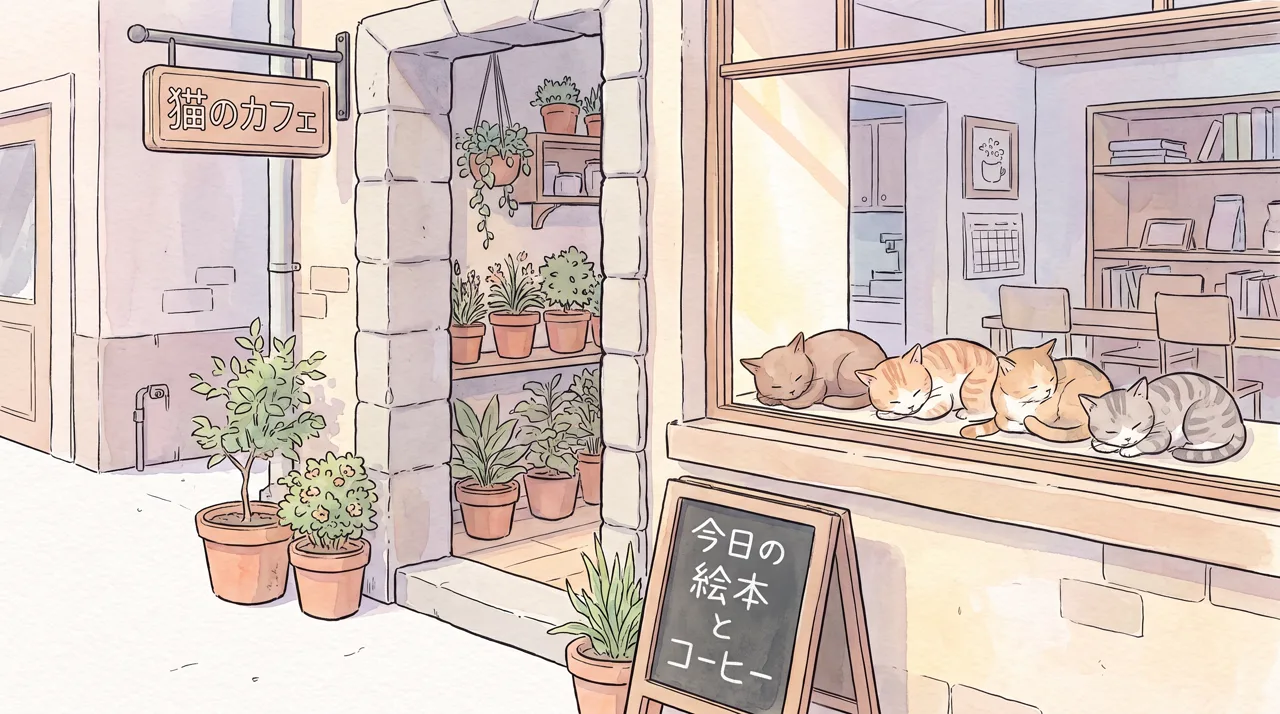
Prompt idea: a small corner cat café, several cats sunbathing on the windowsill, potted plants at the door, storybook look, Watercolor style, 16:9. The Japanese words on the sign and chalkboard appeared on their own, so check any text before you publish, or regenerate.
Lifestyle, reading and personal-essay accounts suit soft watercolor like this: low saturation that doesn’t compete with the text. The prompt is in the cat café entry.
Match the style to the content
| Article type | Suggested style | Add to the prompt |
|---|---|---|
| Work, productivity, tech news | Flat | Two or three named colors, white background |
| Essays, books, lifestyle | Watercolor | Soft washes, muted palette, paper texture |
| Food, cafés, travel | Photoreal | “Color photo”, natural light, the real dish or place |
| Culture, poetry, seasonal festivals | Chinese Ink | Generous white space, pale distant hills |
| Tech, data, industry analysis | Cyberpunk or Liquid Gradient | Deep blue base, glowing lines, empty center |
| Parenting, education, science for kids | 3D Cartoon | Rounded shapes, bright colors |
One caveat for photos: the photo type sometimes returns a moody black-and-white look. For food and travel images, start the prompt with “color photo”.
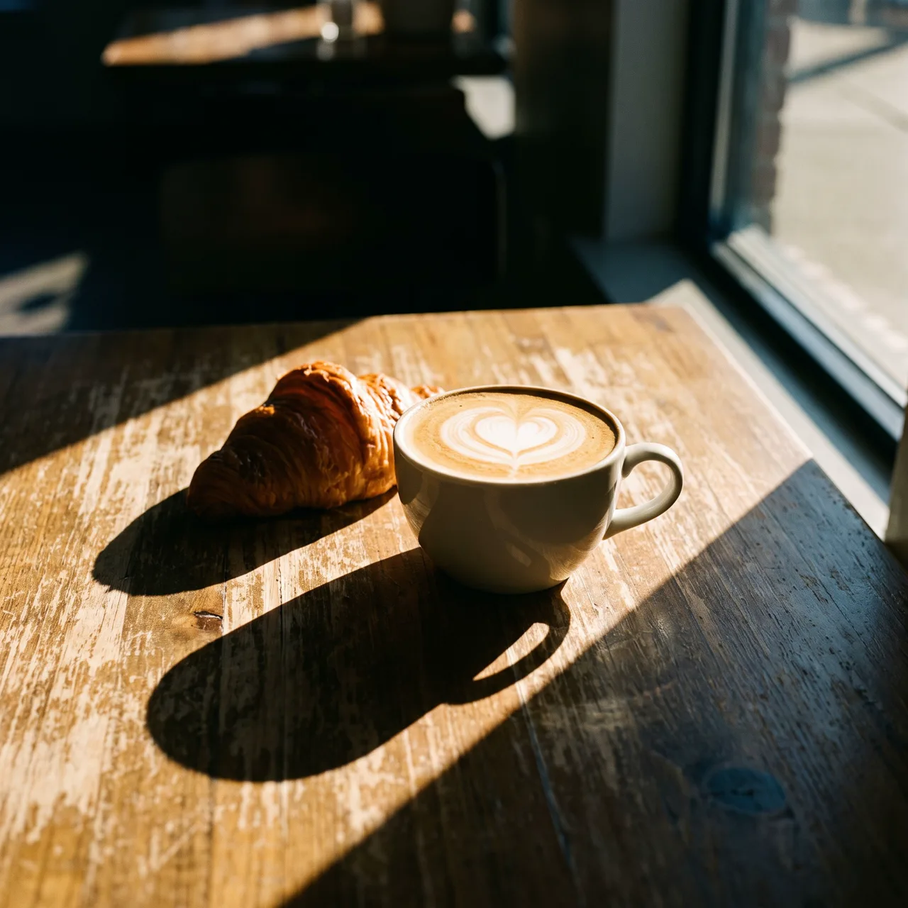
Prompt idea: latte and croissant by a café window in the afternoon, wooden table, warm sunlight, Photoreal style, generated directly at 1:1. For a secondary cover, a square generation saves a crop.
Five prompts to copy
Replace the brackets with your own details and paste into the AI illustration generator.
1. Lead cover: [person or object tied to the topic] in [setting], [two colors] palette, white background, subject in the center, empty space all around
2. Concept image: one scene that shows "[abstract idea]": [concrete metaphor], soft colors, simple composition
3. Square cover: close-up of [one object], centered, plain [color] background, clean and minimal
4. Café or food review: color photo, [dish or drink] on [table surface], natural window light, close-up
5. Section break: [season] [natural scenery], generous empty space, muted colors, quiet mood
More prompts with their original images are in the prompt library.
Before you publish
- Text: any stray letters or garbled words where there shouldn’t be any? Add headlines yourself.
- Crops: preview both the wide cover and the square share card.
- Rights: no brand logos, no real people’s faces, no “in the style of” a living artist.
- Labeling: follow the platform’s AI-content rules; our commercial use guide has the details.
Each image costs 10 credits on the standard model or 4–8 on the others and takes about 30 seconds. You can make one to four per run and keep the best, and failed images are refunded automatically. Images have no watermark and stay in My images for download. If you also present your work on stage, the same style card carries straight over to slide images.