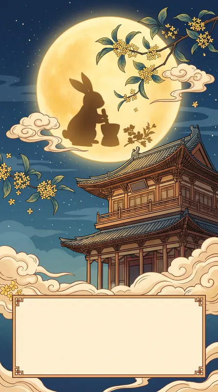
The division of labor that works: AI creates a text-free key visual with space reserved for the headline, and you set the title, date, venue and QR code in a design tool. You get speed from the AI, full control over type, and no misspelled words on a printed poster.
Why not let AI make the whole poster?
By default the generator keeps text out of images unless the prompt explicitly asks for it. Even when it does, headlines, dates and small print often come out misspelled or warped. On a poster every word carries information; one wrong character means a redo.
Posters also change. A show gets added, a date moves, the same design runs on three channels. With the visual and the text on separate layers, edits take minutes and never require a new generation.
If you want a short artistic word baked into the image — say, “SUMMER” as a neon sign — ask for it explicitly and check every letter. Everything informational belongs in the design tool.
The five-step workflow
| Step | What you do | What matters |
|---|---|---|
| 1. Size | Pick a ratio for the channel | 9:16 for phones, 4:5 for feeds, 16:9 for banners |
| 2. Key visual prompt | Theme + atmosphere + palette + empty space | Always state where the space goes |
| 3. Generate and choose | Make four at once | Clean empty area, subject clear of the text zone |
| 4. Typeset | Title, subtitle, details, logo, QR code | Clear hierarchy, two typefaces at most |
| 5. Export and check | Proof the details, export per channel | Confirm resolution before printing |
For ratios, see our aspect ratio guide. When one event needs both portrait and landscape versions, run the same prompt at each ratio instead of cropping one image.
The four parts of a key visual prompt
Take the summer music festival visual from our gallery:
Key visual for a summer music festival poster: a neon guitar and sound waves, crowd silhouettes, fireworks in the night sky, space left at the top for a title
- Theme: neon guitar, sound waves — instantly reads as music
- Atmosphere: crowd silhouettes, fireworks — live energy and celebration
- Palette: neon — sets the color scheme for every related asset
- Empty space: at the top — that’s where the headline goes
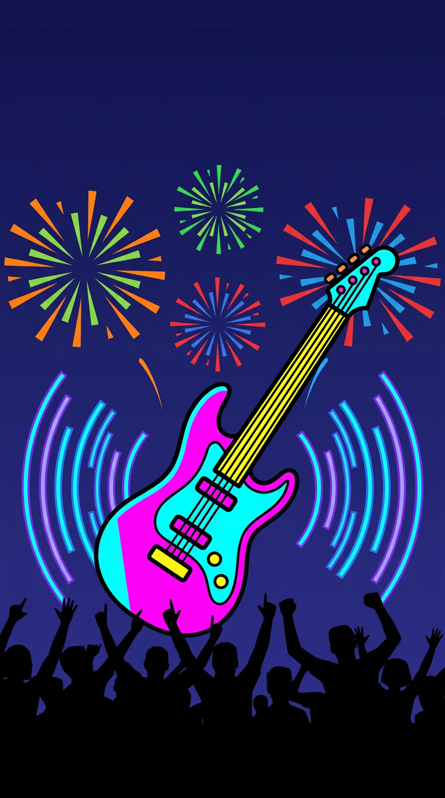
Prompt idea: neon guitar, sound waves, crowd, fireworks, 9:16, with “space left at the top for a title” written explicitly.
Writing negative space the model understands
“Leave space” is too vague. Say where, and what the space looks like:
| Layout | Prompt phrasing | Good for |
|---|---|---|
| Title top, subject bottom | the top third is clean night sky, subject in the lower half | Vertical event posters |
| Text left, subject right | subject on the right, a large plain area on the left | Web banners, slide covers |
| Big centered type | small subject at the bottom, a wide soft gradient in the middle | Holiday and brand posters |
| Info bar at the bottom | the bottom fifth is dark ground or shadow | Posters with date and venue |
When choosing between results, reject any where the empty area is busy — text placed on clutter is hard to read.
Prompt ideas by poster type
Cinematic character poster
Character posters live on placement and mood. This street portrait nails the mood, but the figure is centered and fills the frame, leaving no room for a title.
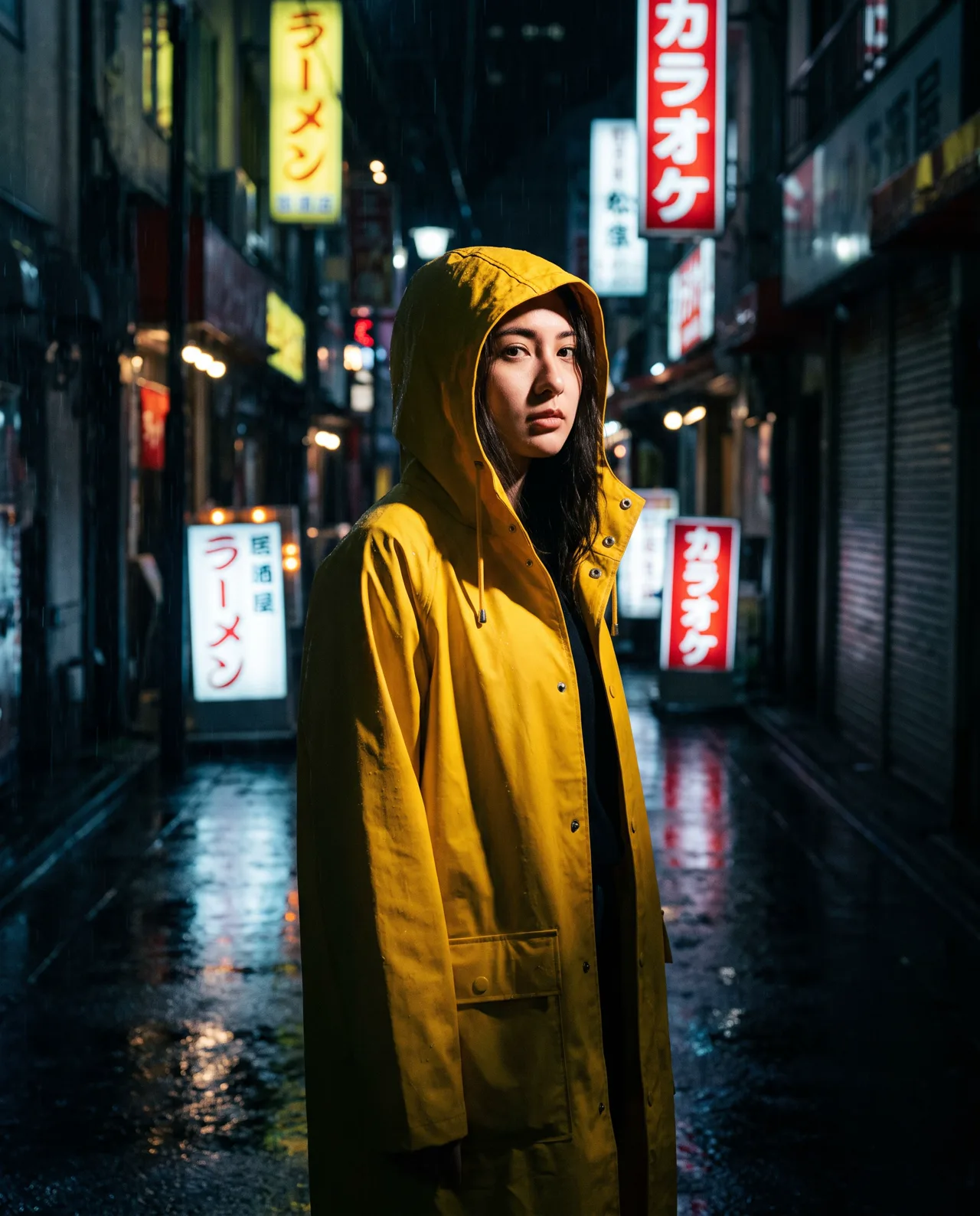
Prompt idea: rainy Tokyo alley, yellow raincoat, neon reflections, Cinematic style. To make it a poster, add “figure in the lower two-thirds of the frame, blurred neon lights above” so the title has somewhere to go.
Product launch poster
Launch posters need energy. If the poster shows your real product, photograph it first and use image-to-image with the photo as a reference, so the product stays accurate.
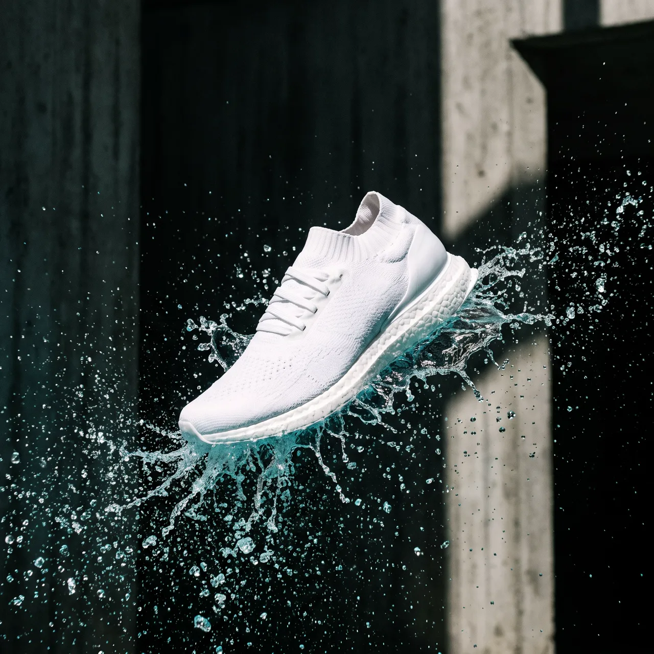
Prompt idea: an unbranded white running shoe bursting through a water splash — add “clean empty space at the top” and it’s ready for a headline.
Seasonal campaign
A huge full moon hanging in the upper part of the frame, silhouetted traditional rooftops and osmanthus branches below, deep blue and warm gold palette, space for a title across the middle, vertical
For Chinese-style seasonal posters, our Chinese-style prompt guide covers ink wash and Dunhuang looks.
Minimal brand poster
Soft flowing liquid gradient background in teal, rust red and warm orange, fine grain, a large clean area in the center
Abstract backgrounds never fight the type, which makes them ideal for manifestos and launch countdowns. See the liquid gradient example.
A series that looks like a series
For a recurring event or a set of posters, keep three things fixed: the style preset, the palette words and the position of the empty space. Then change only the theme element — guitar for the music night, film reel for the screening, chess pieces for the tournament. The posters will read as one campaign even though each visual is new, and your type layout can be reused unchanged.
Typesetting tips
- Three levels of hierarchy: title largest, subtitle next, details smallest. Two typefaces at most.
- Keep text in the empty area. On busy backgrounds, add a gradient or semi-transparent block behind the text.
- Complete the details: date, time, venue, organizer, price, QR code — proofread every one.
- Check font licenses. Many fonts need a commercial license. Open-source families released under the SIL Open Font License are a safe default.
Check resolution before printing
Output goes up to 4K on Nano Banana Pro, Nano Banana 2 and GPT Image 2, roughly 4,000 px on the long side; the standard model is about 2K. Here’s what that covers:
| Use | Enough? |
|---|---|
| Phones, messaging, social | Yes |
| Screens, projectors, digital signage | Yes |
| Prints up to A4 / US Letter | Yes, 300 dpi on 4K models; about 200 dpi on the standard model |
| A3 prints | Mostly, about 240 dpi on 4K models; not on the standard model |
| Roll-up banners, outdoor | No, needs separate handling |
Before you publish
- Proofread dates, times and QR codes one last time.
- No other brands’ logos, celebrities or real people’s faces.
- Disclose AI-generated content where platforms require it; see commercial use of AI images.
Open the AI poster generator and run the festival prompt above four times. More poster backgrounds are waiting in the prompt library.