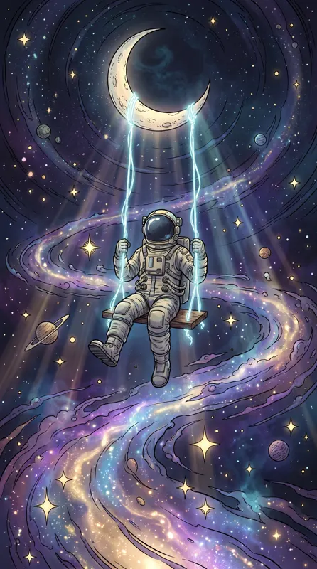
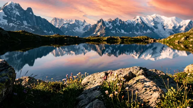
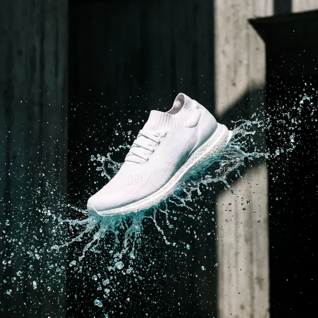
To make AI images for presentations that actually work, do two things: generate backgrounds at 16:9 and say in the prompt where the empty space for text goes, and give the whole deck one style preset plus one fixed style sentence, so you change the subject from slide to slide, never the style.
Four kinds of slide image
Before you write a prompt, decide what the image is for. A full-bleed background and a small illustration beside a bullet list need very different prompts.
| Type | Ratio | Placement | Prompt focus |
|---|---|---|---|
| Title and section backgrounds | 16:9 | Full bleed | Planned title area, one memorable visual |
| Content-slide backgrounds | 16:9 | Full bleed with text on top | Low detail, low contrast, mostly color and texture |
| Concept illustrations | 1:1 or 4:5 | Next to text, about half the slide | Plain background matching the slide color |
| Full-image and transition slides | 16:9 | One image, one sentence | Strong visual impact, a clear subject |
At 16:9 our generator outputs up to 4K, roughly 4,000 px on the long side, which matches 4K projectors and screens; even the standard model’s 2K is more than a 1920×1080 projector needs, so it stays crisp on a conference screen. Other formats are covered in the aspect ratio guide.
Backgrounds: plan the text space first
The classic failure is a beautiful background with nowhere to put the title. Decide where the text goes before you generate, and put that decision in the prompt:
- Centered title: “a clean empty title area in the middle of the frame”.
- Image left, text right: “subject in the left third, large empty area on the right”.
- Image top, text bottom: “subject in the upper half, calm plain area below”.
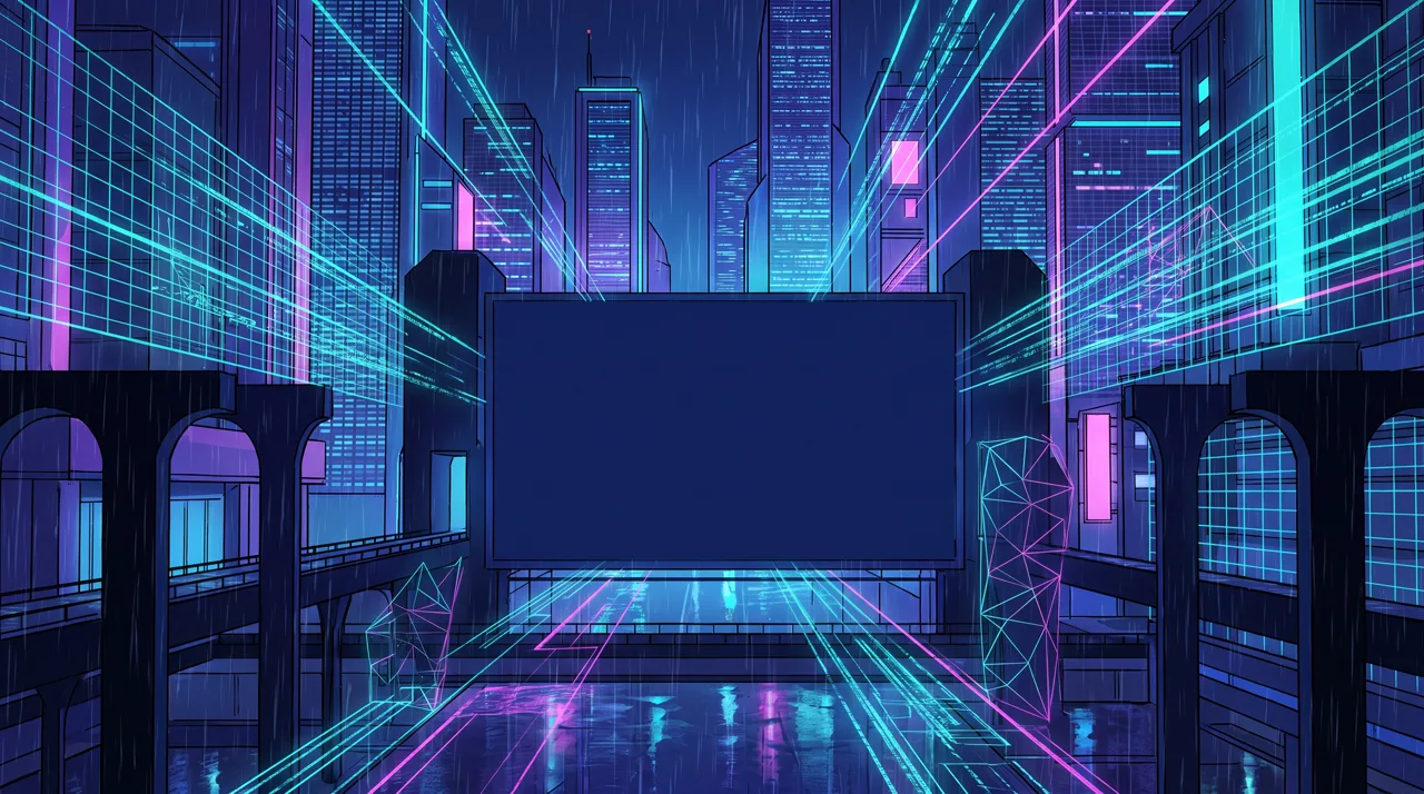
Prompt idea: a tech conference key visual, glowing data streams and grids in deep blue space, violet and cyan neon, empty space in the middle for a title, Cyberpunk style, 16:9.
Here the “empty space for a title” was drawn as a blank screen, so the title drops straight in, and the perspective lines lead the eye to it. For a launch event or a pitch, start from this prompt and swap in your brand colors.
Content-slide backgrounds should be quiet. The less detail, the better: “low contrast, soft tones, simple texture”. If text is still hard to read on the slide, lay a semi-transparent white or dark shape over the image and put the text on that.
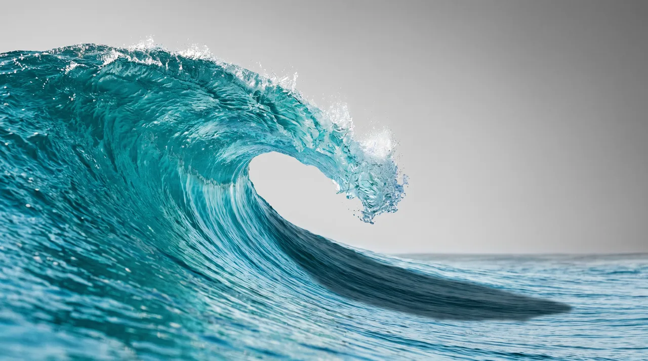
Prompt idea: a curling turquoise wave in clear sunlight, glassy water, Photoreal style, 16:9. The wave stays on the left, and the grey sky on the right holds a title and three to five bullet points.
One deck, one look: a preset plus a style anchor
A 20-slide deck with a photo on the cover, a flat illustration on slide five and a 3D cartoon on slide ten looks pieced together, however good the content. Consistency takes four habits:
- Choose one style preset for the occasion and use only that one.
- Write one style anchor sentence with your main colors and texture, and paste it at the end of every prompt.
- Change only the subject and composition. Never edit the anchor.
- Generate two to four images per slide and keep the one that sits best next to the slides you already have.
| Occasion | Suggested style | Example style anchor |
|---|---|---|
| Product launch, investor pitch | Cyberpunk or Liquid Gradient | Deep navy base, glowing cyan and violet lines |
| Team updates, training | Flat | Blue and slate grey, white background, simple outlines |
| Brand proposals, lifestyle | Photoreal | Color photo, natural light, warm beige tones |
| Culture or history lessons | Chinese Ink | Pale ink hills, generous white space, rice-paper texture |
| Classrooms, kids’ events | 3D Cartoon | Rounded shapes, bright pastel colors |
With Photoreal, put “color photo” in the anchor; the photo type occasionally returns a black-and-white look otherwise. If one character or product appears across the deck, such as a company mascot, upload it to image-to-image and describe each slide’s scene. It keeps its look from slide to slide.
Concept illustrations: blend them into the slide
Content slides often need a small image to carry an idea: growth, teamwork, risk. There is no background removal, so every image comes with a full background. The trick is to make the image background match the slide: white slides get “plain white background” in the prompt; light grey slides get “plain light grey background”.
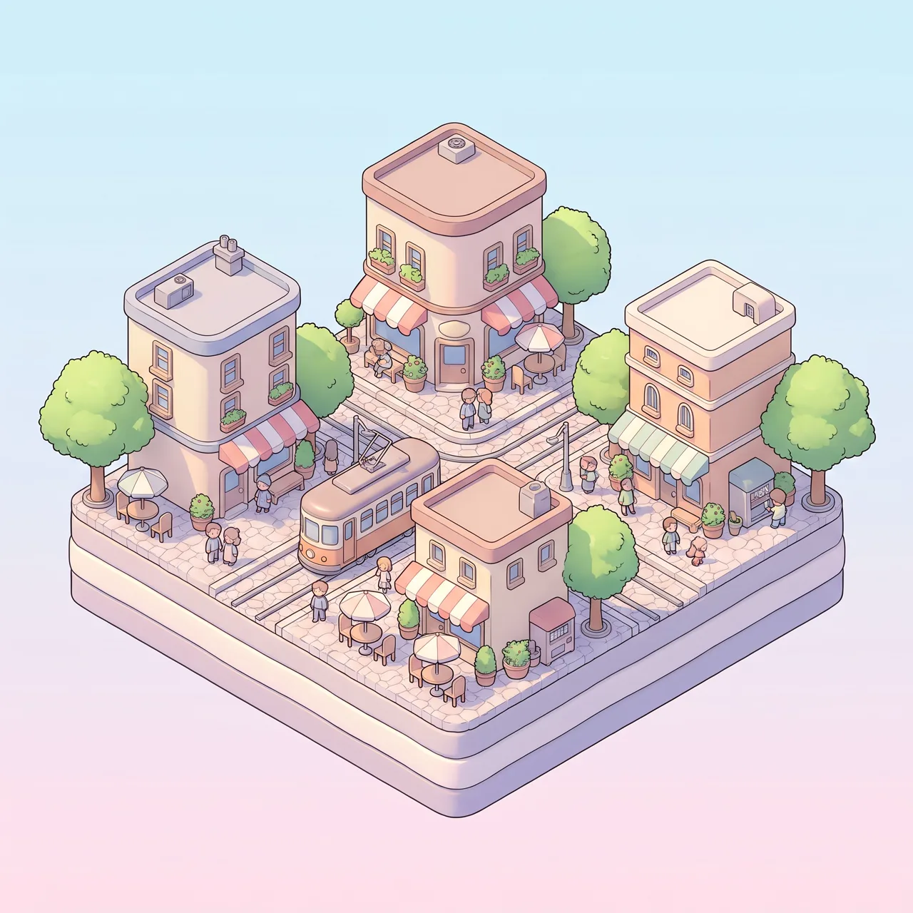
Prompt idea: a cute isometric miniature city block with cafés, trees, a tram and tiny people, pastel colors, 3D Cartoon style, 1:1. Set beside a list of markets or locations, it suits a light template.
Visual metaphors that work well for business ideas:
| Idea | Visual metaphor |
|---|---|
| Growth | A staircase rising to a small flag at the top |
| Teamwork | Several hands placing the last piece of a jigsaw |
| Risk | A person stepping carefully across thin ice |
| Efficiency | A straight conveyor belt carrying neat little boxes |
| Transformation | A butterfly just out of its cocoon |
Prompts to copy
Fill in the brackets and generate at 16:9 in the AI illustration generator or text-to-image.
1. Title background: [theme imagery], [main color] palette, a clean empty title area in the middle, simple background detail
2. Section slide: [scene], subject in the left third, large empty area on the right, soft low contrast
3. Content background: minimal abstract background, soft gradient from [color] to [color], subtle texture, almost no pattern
4. Concept illustration: one scene showing "[idea]": [metaphor], [style anchor], plain white background, subject centered
5. Transition slide: [dramatic scene], strong light and shadow, wide view, one clear subject
Example for a quarterly update in Flat style: One scene showing “quarterly growth”: a person climbing a staircase that rises to a small flag, blue and slate grey, white background, simple outlines, subject centered
The prompt library has more 16:9 backgrounds and illustrations with their original prompts.
Checks once the images are in your deck
- Text: titles and numbers go in text boxes, not in the image. If stray letters show up, regenerate or cover them with a shape.
- Contrast: projectors wash colors out. Text that is just readable on your laptop may vanish on the wall, so add the overlay anyway.
- File size: a deck full of 4K or 2K images gets heavy. PowerPoint and Keynote both have built-in options to compress or reduce image size.
- Rights: in client decks and paid talks, avoid brand logos and real people’s faces; see our guide to commercial use of AI images.
A typical deck needs five to ten images. Each costs 10 credits on the standard model or 4–8 on the others and takes about 30 seconds, and failed images are refunded automatically. Make two to four per slot, keep one, and check the pricing page to budget. The same style anchor works for article covers too; see WeChat article images.