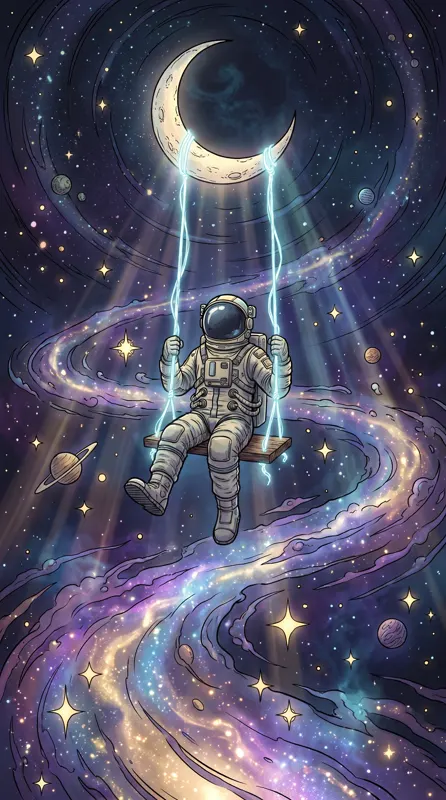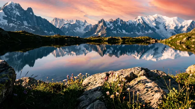
Pick the ratio before you write the scene: 9:16 for phones, 16:9 for computers. On a phone, keep the top of the image clean for the clock and put the subject in the middle. On a desktop, push the subject to one side and leave the other side for icons. Calm, evenly detailed styles age best.
Choose the ratio: two outputs cover almost everything
There are four ratios, and wallpapers mainly need two. Here’s what happens when each fills a real screen:
| Device | Ratio to pick | Typical screen shape | When it fills the screen |
|---|---|---|---|
| Modern phone | 9:16 | Roughly 19.5:9 to 20:9, taller | About a tenth cropped off each side |
| Tablet | 1:1 | Roughly 4:3 to 3:2, rotates | Some crop either way; centered subjects survive |
| Standard monitor | 16:9 | 1920×1080, 2560×1440 | Fills almost perfectly |
| 16:10 laptop | 16:9 | 16:10, slightly squarer | About 5% off each side |
| 21:9 ultrawide | 16:9 | Roughly 21:9, wider | About an eighth off top and bottom |
| 4K monitor | 16:9 | 3840×2160 | Sharp on 4K models; the 2K standard model is scaled up, slightly soft |
Those crop figures come straight from the geometry of each screen shape. The takeaway: important things go in the middle; edges belong to sky, water and texture that can afford to lose a strip. For ratio basics, see how to choose an AI image aspect ratio; this post focuses on wallpapers.
Phone wallpapers: lock screen vs home screen
The same image gets covered by completely different things on each screen.
Lock screen: clock on top, buttons below
The big clock and date take roughly the top quarter; flashlight and camera buttons and notifications sit at the bottom. So:
- Keep the top clean. Night sky, open sky, mist or a smooth gradient. Write “a wide clean night sky across the top of the frame.”
- Center the subject vertically. People, animals and buildings in the middle won’t be hidden by the clock or notifications.
- Let the bottom be quiet. Sand, water and grass are perfect down there.
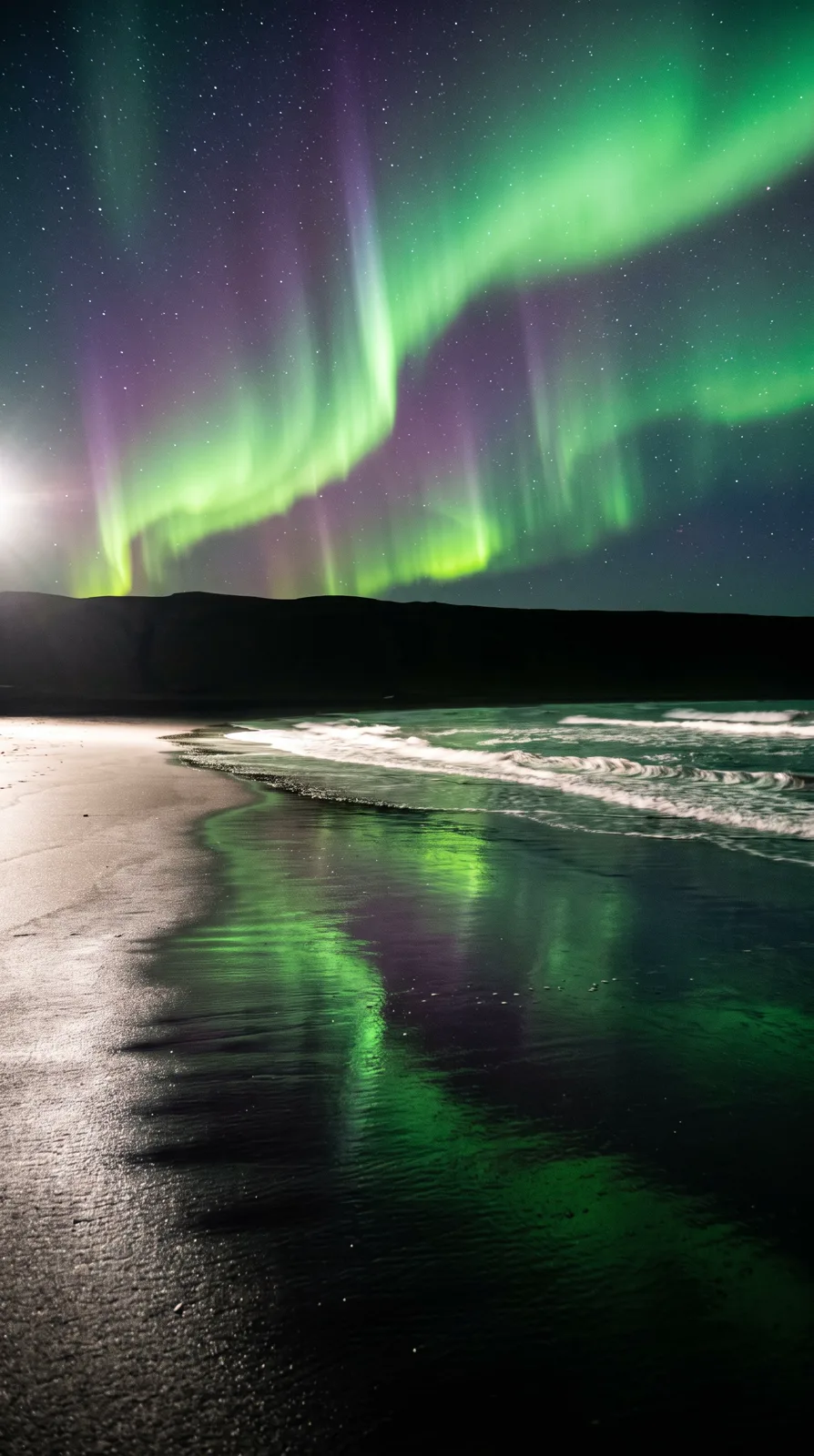
The aurora cover follows this structure: green and violet ribbons and stars above, the horizon in the middle, wet black sand reflecting the light below.
Home screen: icons cover everything
A grid of icons and a dock chop any detail into pieces. The best home-screen wallpapers have even detail and no single focal point: gradients, water, fog, stars, texture. Faces and pets are a gamble — an icon tends to land right on the eyes.
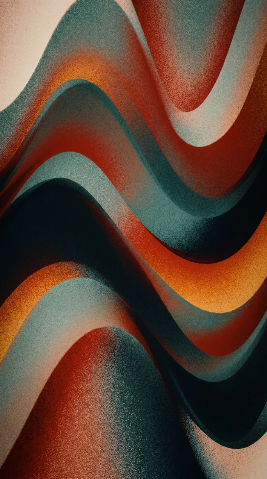
Prompt idea: liquid gradient of layered waves in teal, rust red and warm orange, fine grain texture, 9:16, Liquid Gradient preset.
Nothing here needs protecting, so icons sit on top cleanly. For something calmer, name fewer colors: “a gradient from deep navy to dark teal.”
Desktop wallpapers: subject to one side
Desktops have fewer obstructions but they sit in fixed places. Windows lines desktop icons up from the left by default, macOS stacks desktop files on the right, there’s a taskbar or Dock at the bottom, and macOS adds a menu bar on top.
The general recipe: put the subject on the left or right third, keep the other side clean, and place the horizon near the lower third. Write it directly: “subject on the left side of the frame, clean grey sky on the right.”
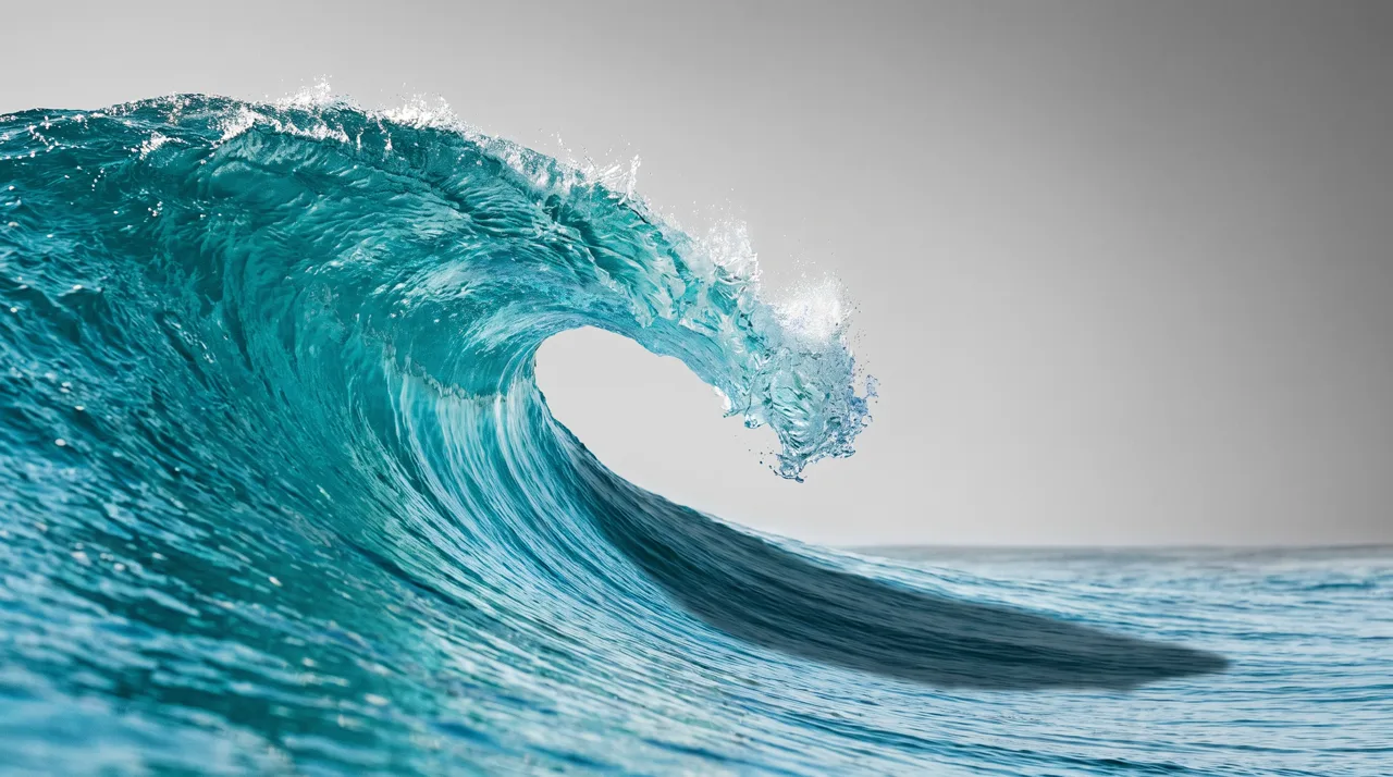
Prompt idea: a powerful turquoise wave curling in clear sunlight, crystal water, subject on the left, clean sky on the right, 16:9.
The right side is nearly empty, which suits Mac users with files on the desktop. On Windows, swap it: “the wave on the right side of the frame.”
Styles that make good wallpapers
| Style preset | Good subjects | Prompt tips | Watch out for |
|---|---|---|---|
| Photoreal | Aurora, alpine lakes, waves, forests | Name the time and light; add “color photo” | The photo type occasionally returns black and white |
| Liquid Gradient | Home screens, dark mode | Two or three colors plus “grain” | Fewer colors, calmer result |
| Chinese Ink | Mountains, cranes, bamboo | “generous white space”, “pale ink” | The white space is where icons go |
| Anime | Skies, clouds, seaside towns | Describe the sky and time of day | See our anime guide |
| Cyberpunk | Rainy streets, neon alleys | Neon colors, rain, reflections | Sign lettering is usually gibberish up close |
| Fantasy | Starfields, floating islands, moons | “dreamy”, “galaxy”, “soft glow” | Keep the subject small enough for the clock |
| Flat, Pixel Art | Minimal scenery, retro games | State the number of colors | Simple shapes stay crisp when scaled |
Chinese ink wash is a natural fit thanks to its empty space:
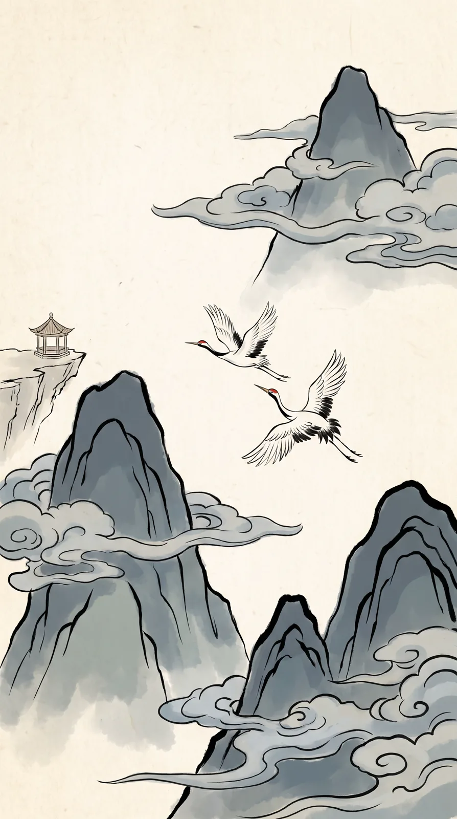
Prompt idea: among ink-wash mountains, two cranes glide past mist-wrapped peaks, a small pavilion in the distance, 9:16, Chinese Ink preset.
For anime skies and seaside scenes, see the AI anime art guide.
Copy-and-paste wallpaper prompts
Swap the bracketed parts and paste into the AI wallpaper generator.
Phone (9:16):
1. Aurora over [place], green and violet ribbons reflected on [water/wet sand], a sky full of stars, wide clean night sky at the top, color photo
2. Flowing liquid gradient of [color one] and [color two], soft wave curves, fine grain texture, calm and minimal
3. Ink-wash mountains with [small element] in the middle of the frame, drifting mist, generous empty space at the top and left, pale ink
4. A rainy night [city street], neon reflected in puddles, a [person or animal] in the lower middle, dark sky above
5. A [season] evening at the [seaside/hillside], towering clouds and sunset glow, [foreground] at the bottom, anime style
Desktop (16:9):
6. [Mountains/lake] at sunrise, subject on the left third, clean sky on the right, horizon on the lower third, color photo
7. A [forest/bamboo grove] in morning mist, sunbeams through the fog, quiet scene with even detail, color photo
8. Minimal gradient curves in [colors], lots of empty space, soft and clean, desktop background
9. A pixel-art [scene], 16-bit retro game style, subject on the right, open sky on the left
The prompt library has more with finished images — try aurora over a black-sand beach or the turquoise wave and change the place and colors. When you run out of words for light and color, our AI image keywords list has plenty.
Make a matching set
For a phone-and-desktop pair, run the same prompt at 9:16 and 16:9 and swap the composition words: “subject in the middle, sky across the top” for the phone, “subject on the left, empty space on the right” for the desktop. Each run is a new image, so you get a matching theme and palette rather than two crops of one picture.
You can also make a day and a night version — “soft morning sunlight” versus “deep blue night sky with warm window lights” — to pair with light and dark mode.
Check before you set it
- Preview on the device. Is the clock on the subject? Is an icon over something important?
- Look at the edges. Nothing essential should sit where the crop lands.
- Look for stray lettering. Text is kept out by default, but signs and book spines sometimes show garbled characters. You’ll notice eventually, so regenerate.
- Generate several. Each image costs 10 credits on the standard model or 4–8 on the others and takes about 30 seconds; making two to four and picking one beats endless prompt tweaking.
Ready? Open the studio and start with template 1.